Diego Bartolo
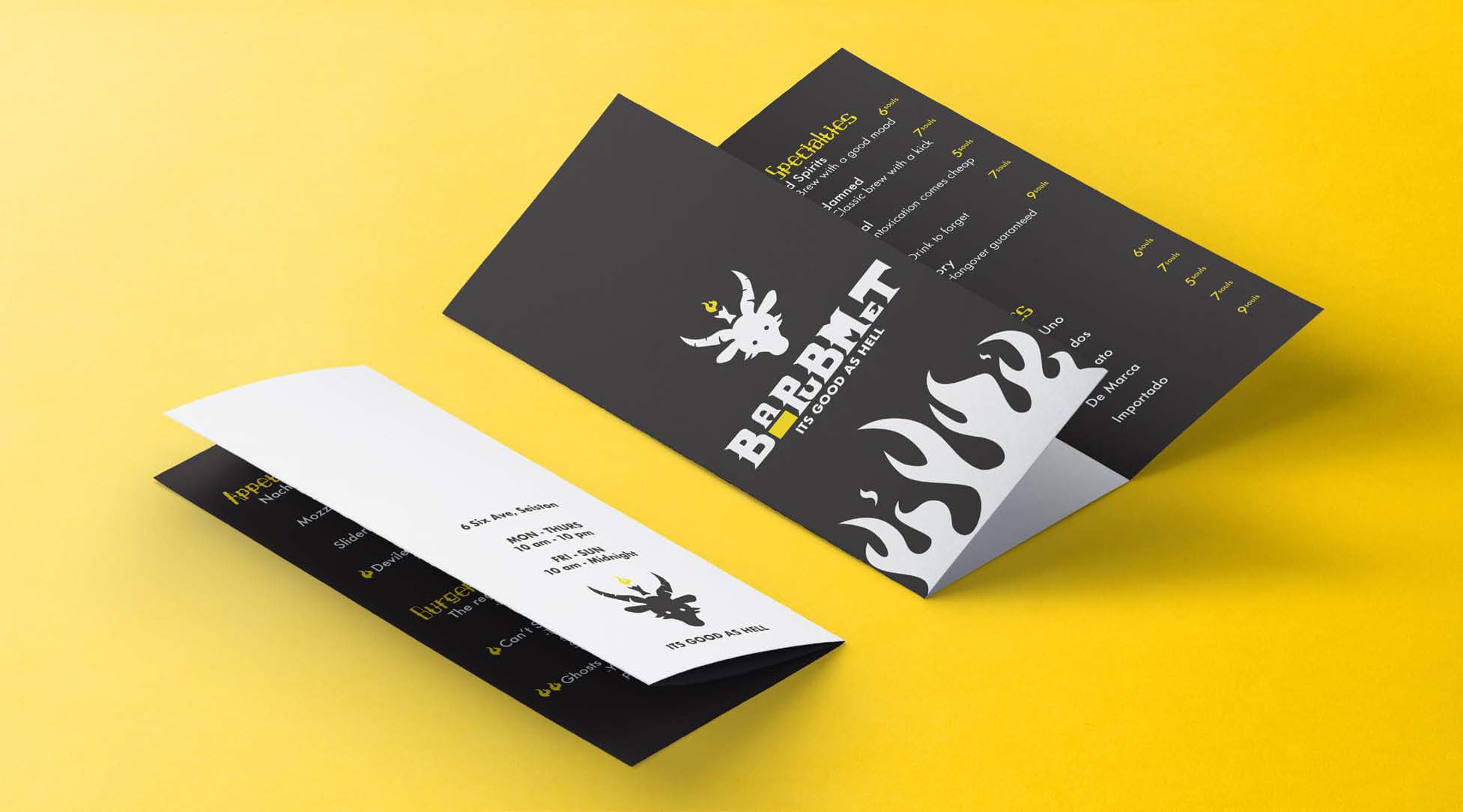
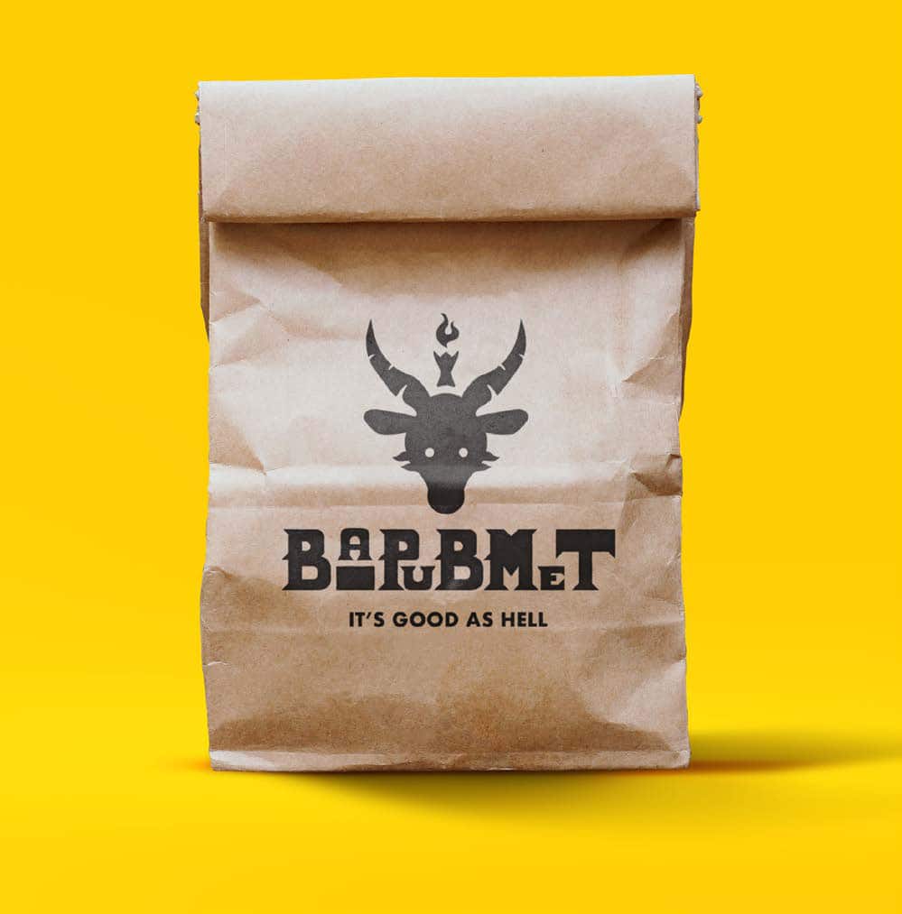
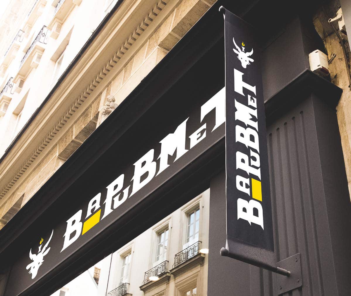
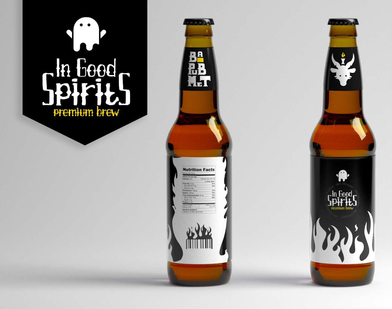
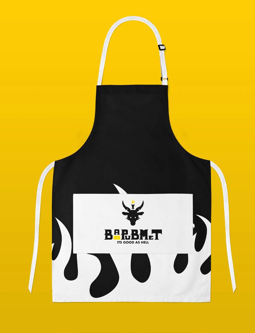
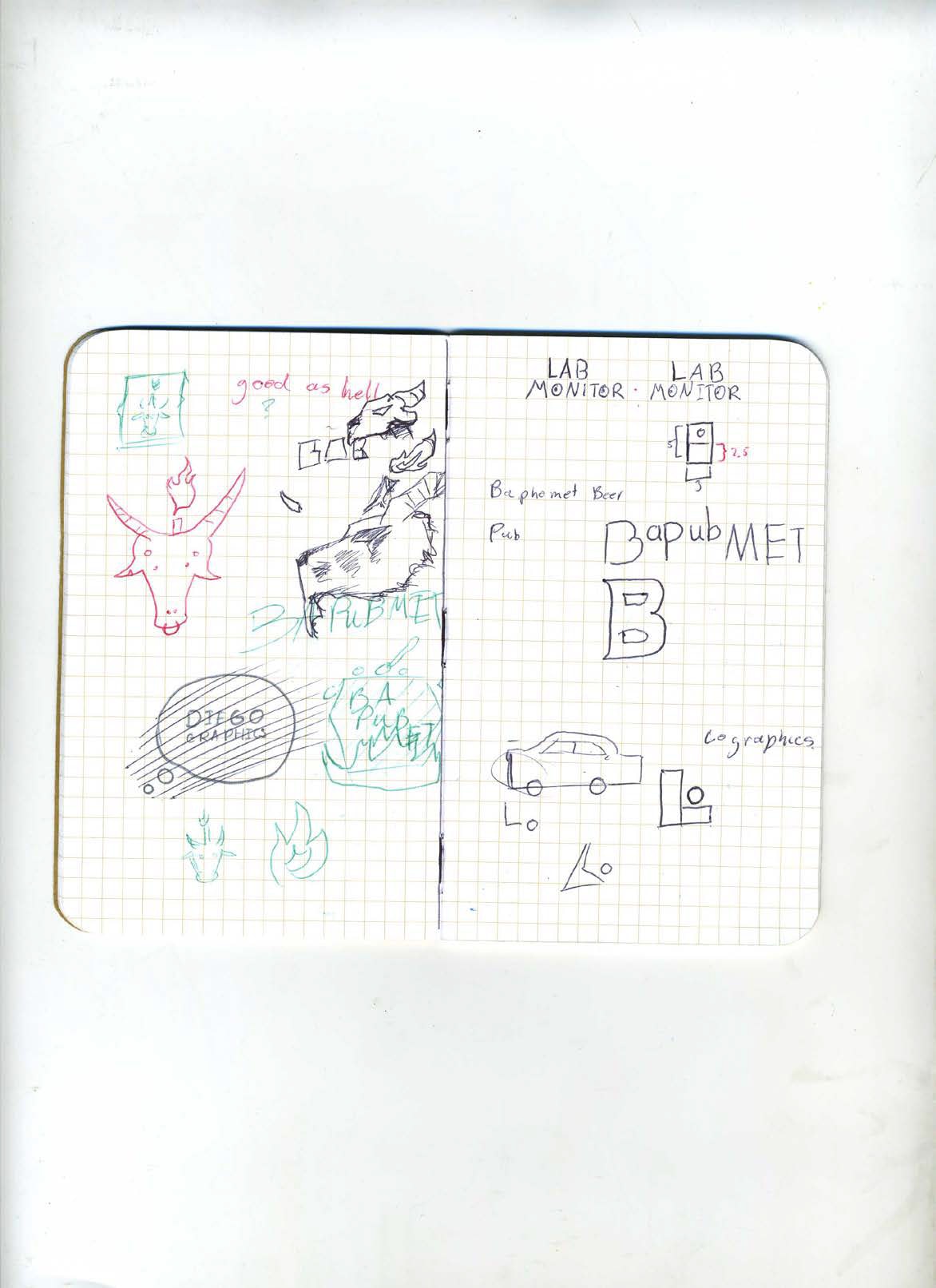
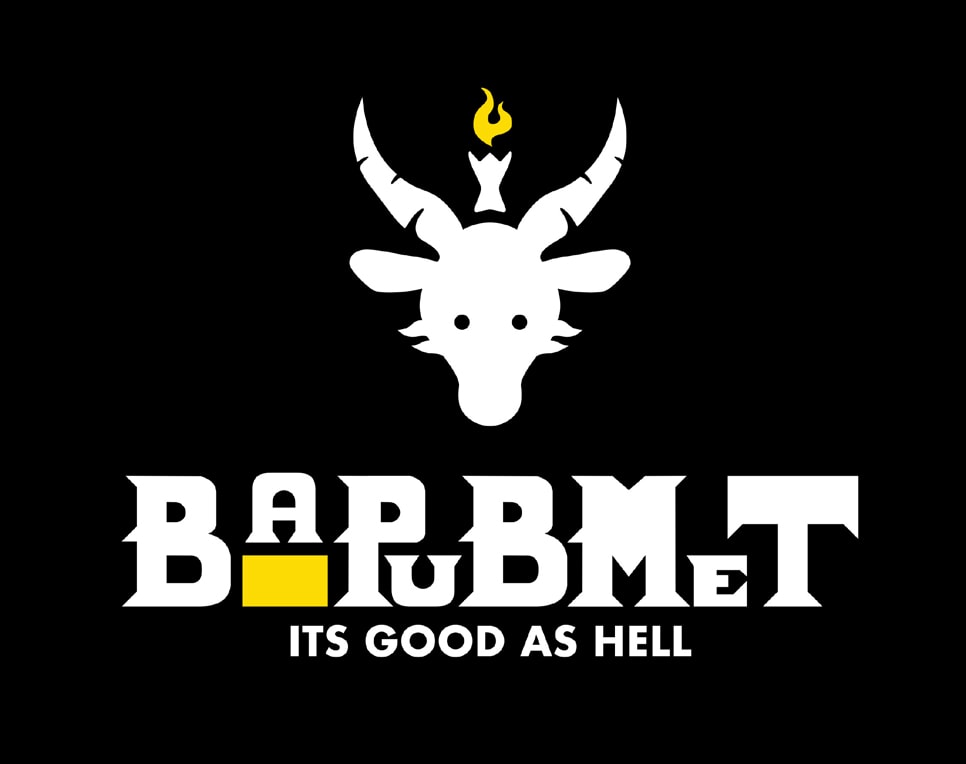
Bapumet – Demon Themed Bar
This themed bar is a comedic take on darker lore. Taking ideas to cartoon the creature, Baphomet and using a yellow amber resembling a beer’s color, the brand comes off as playful despite its more gothic typography.
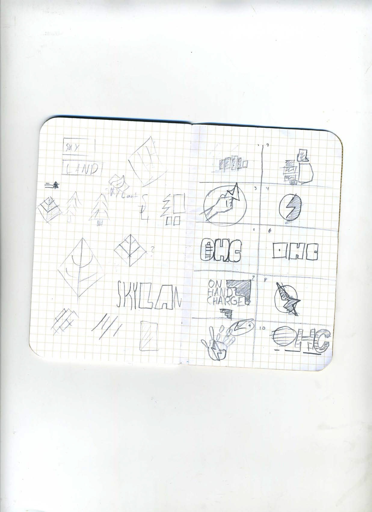

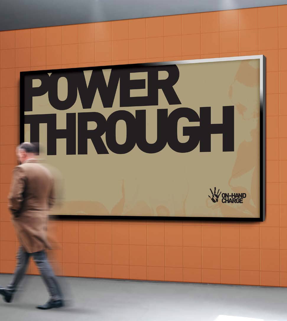
On-Hand Charge – Portable Battery Packs
On-Hand Charge is a mobile charge company for the outdoor explorer. Using mud tones and a handprint reminiscent of cave paintings, it’s clear that the company is meant for those who are constantly outdoors.
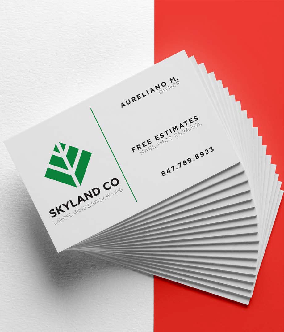
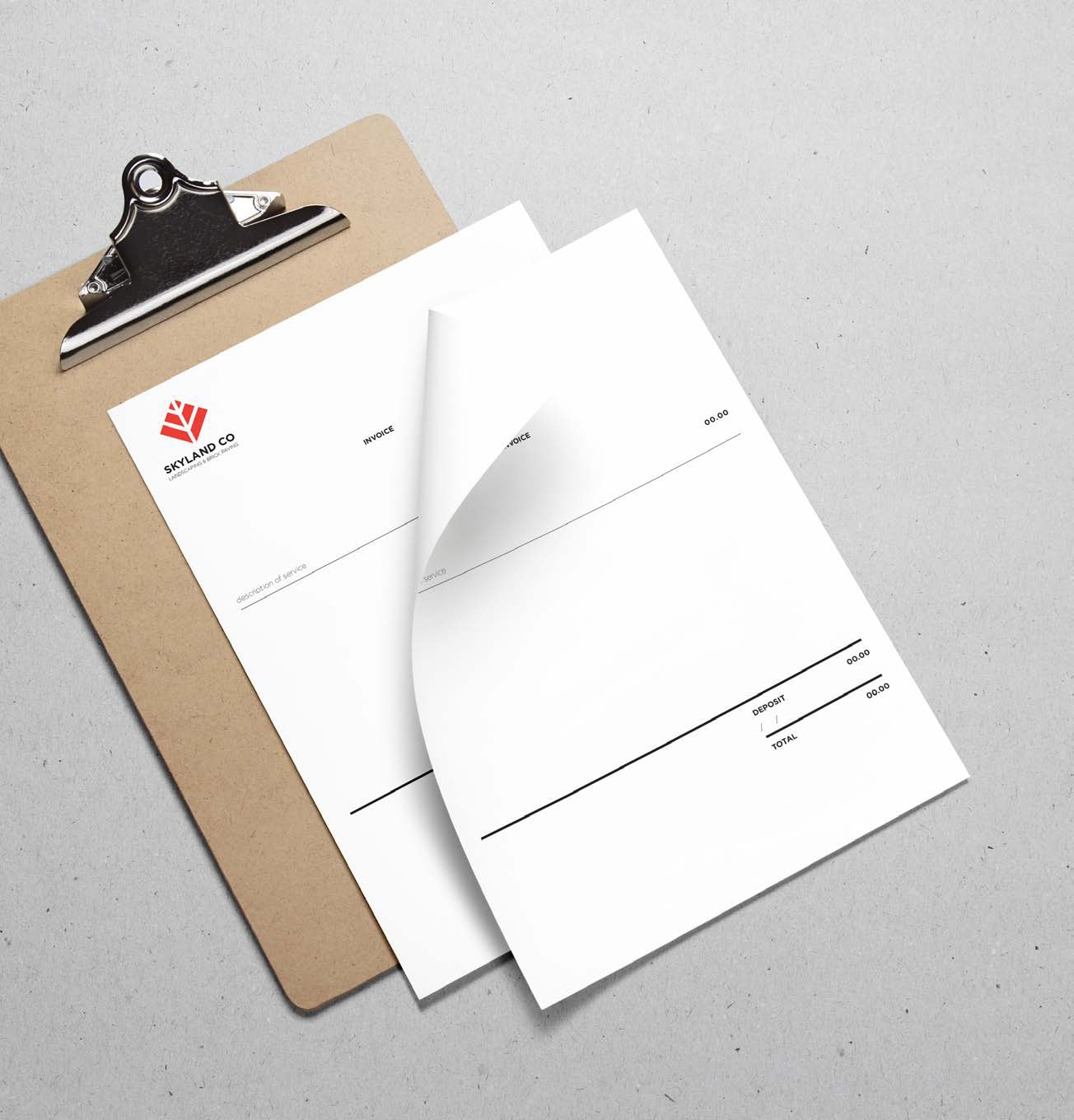
Skyland Co – Landscaping and Brick Paving
Being a company that works in different services the logo of the company needed to be descriptive of that. In this logo the red color resembles bricks being laid perpendicular of each other. In green, however, it looks like a geometric leaf. This duality of the logo helps organize invoices to clearly state what type of service they are giving to a customer.
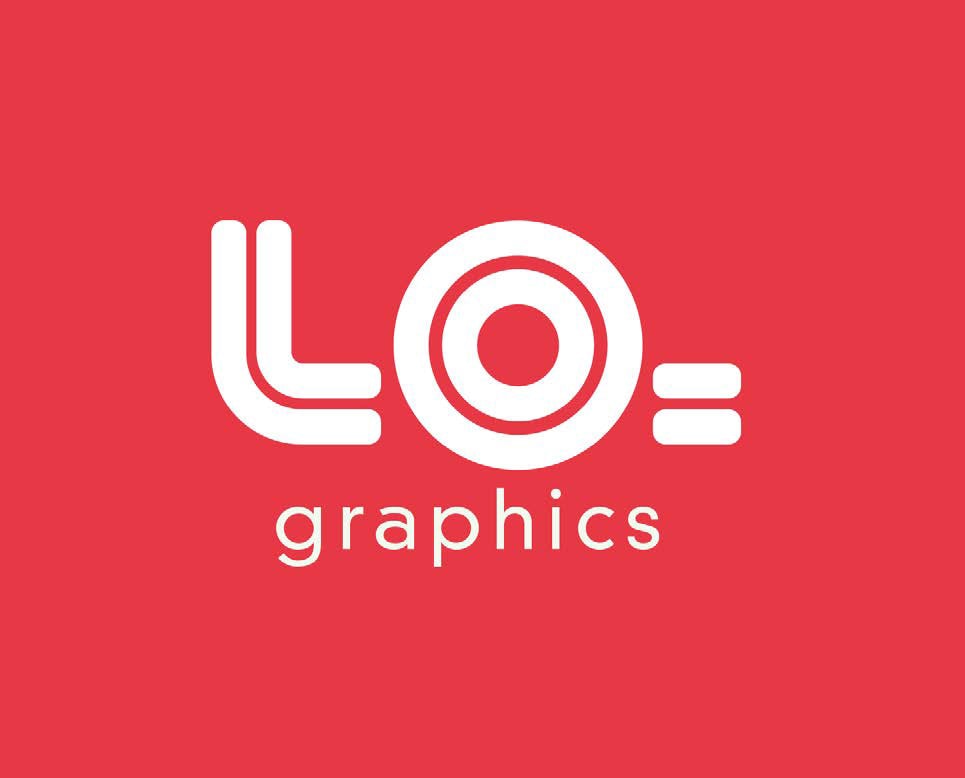
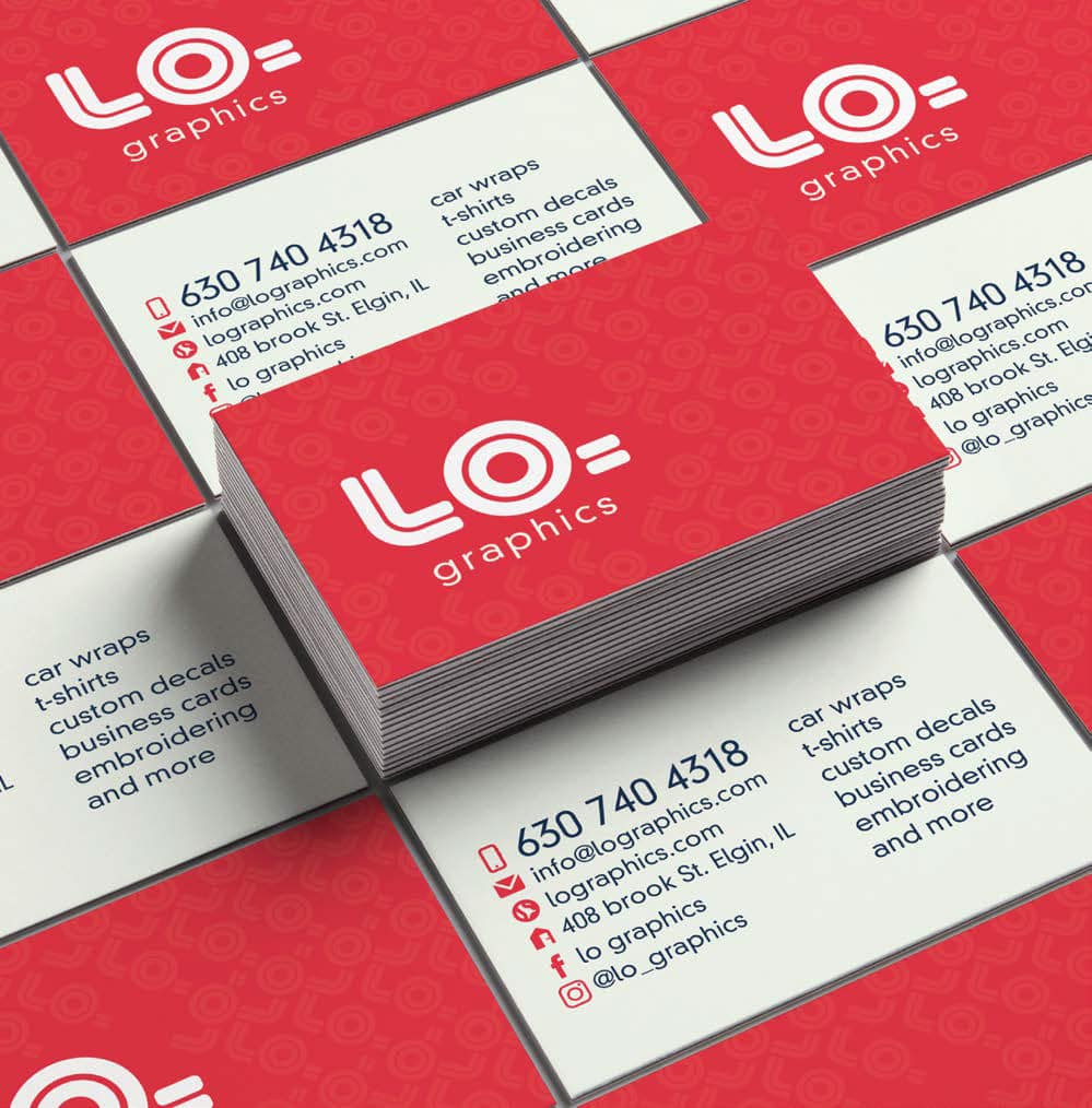
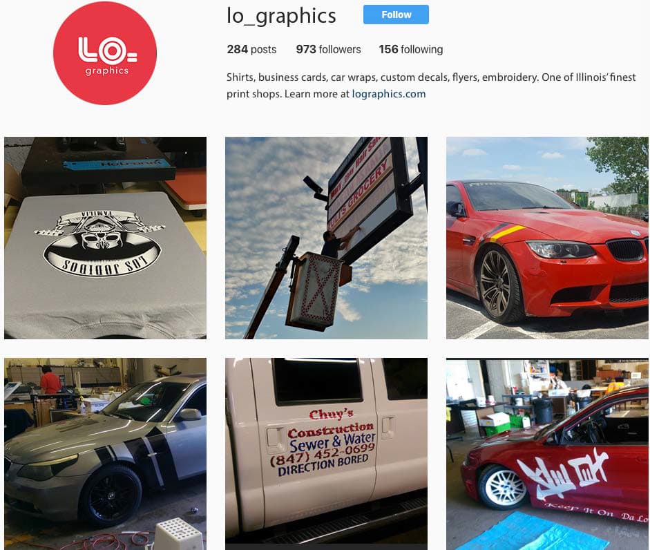
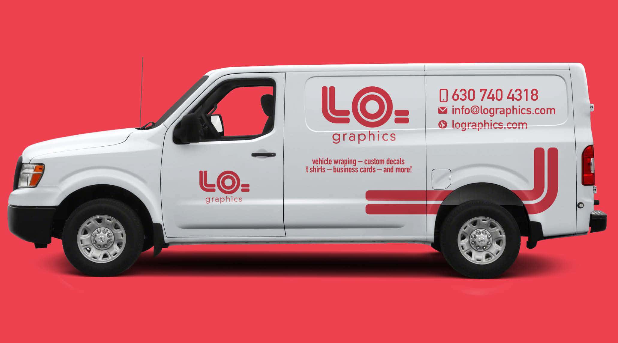
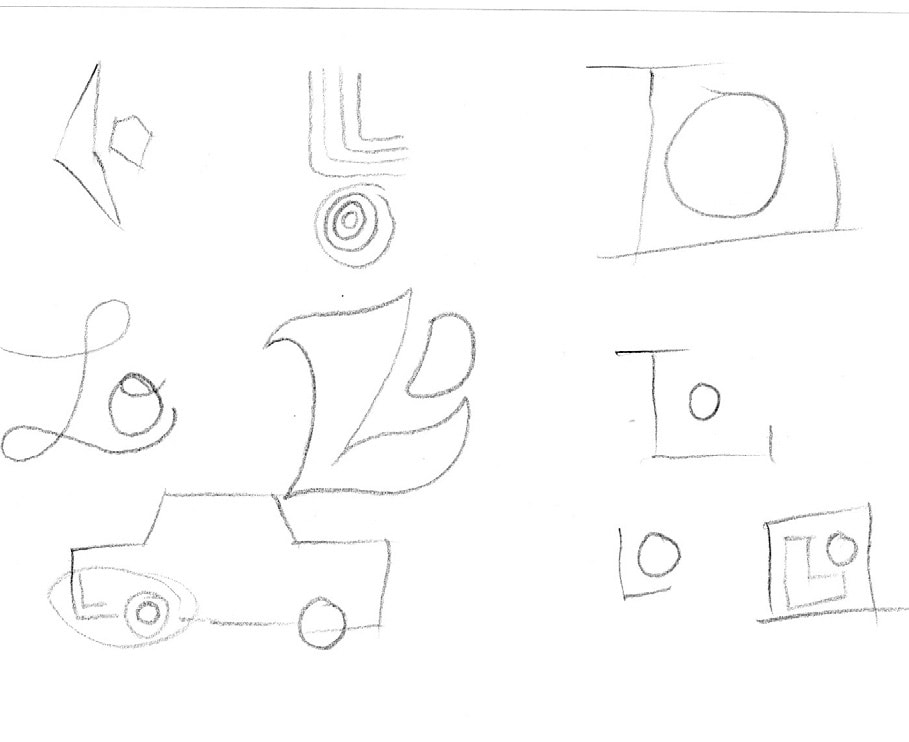
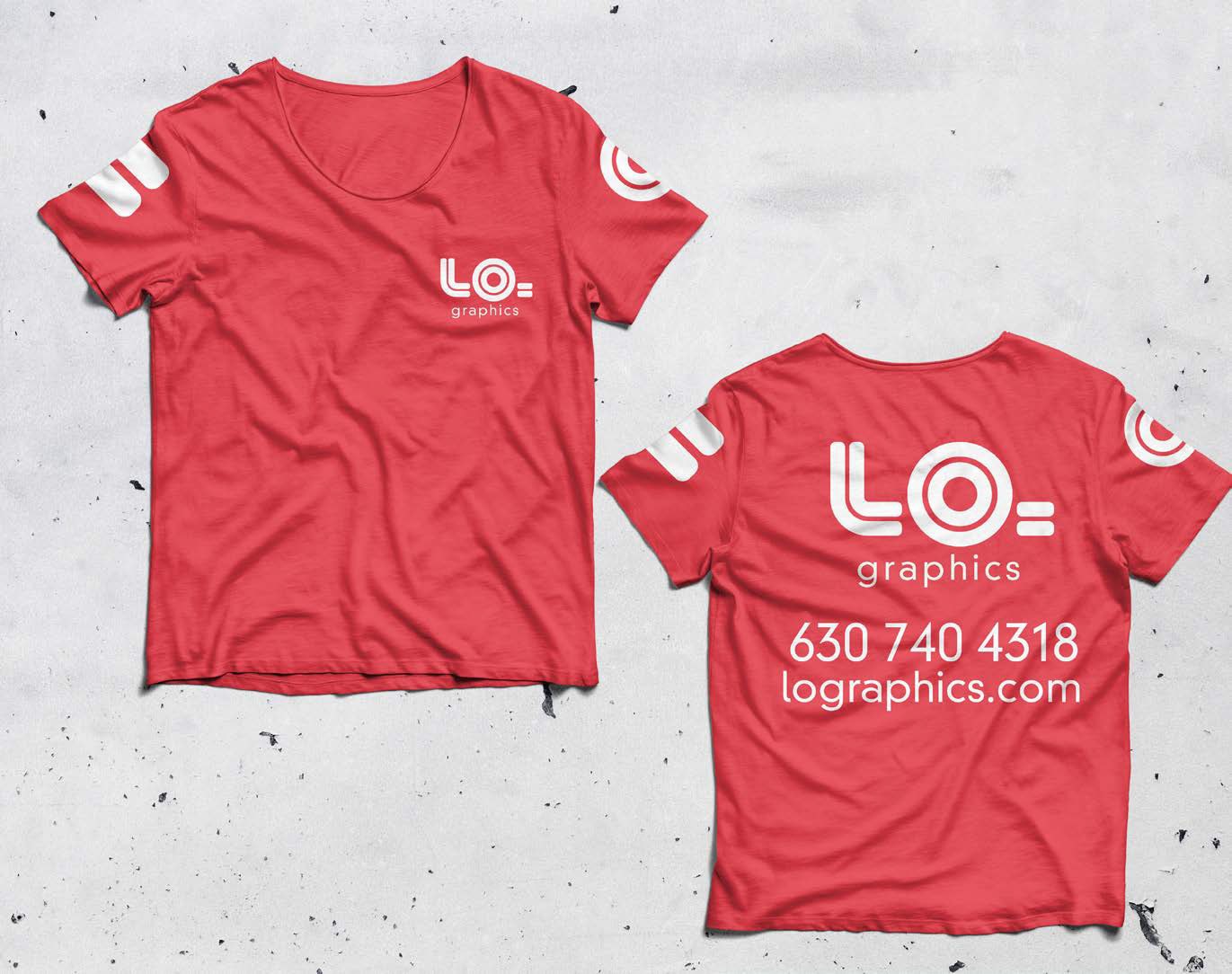
Lo Graphics – Company Re-brand
Starting a business with my dad was a big step into my design career, yet that very business lacked any sort of branding due to the level of design skill both of us had when we began the company. Now, seeing how the business has grown, I am branding LO Graphics to make it look more professional and appeal to the more corporate clients we are starting to receive.
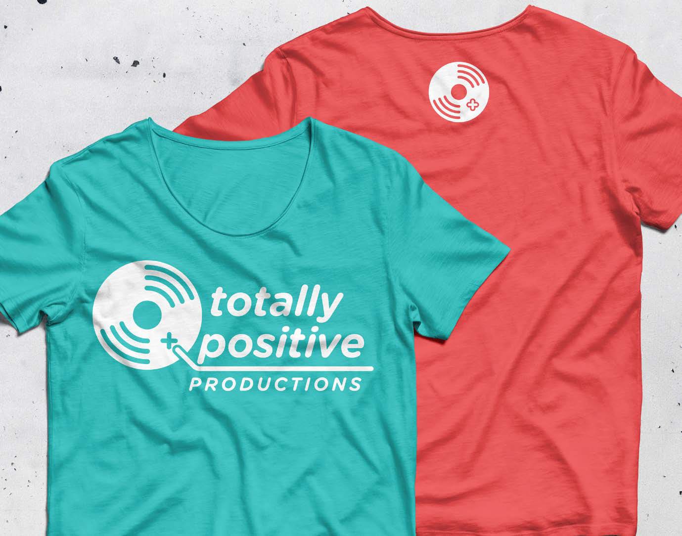
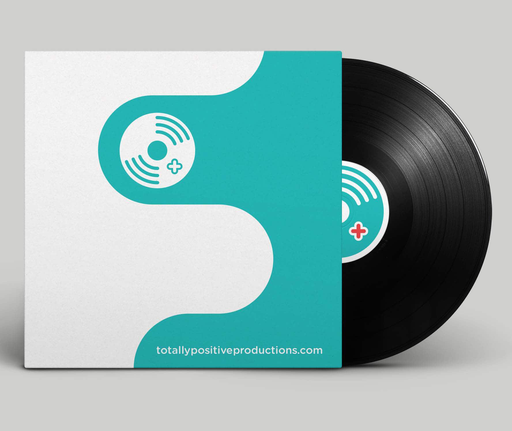
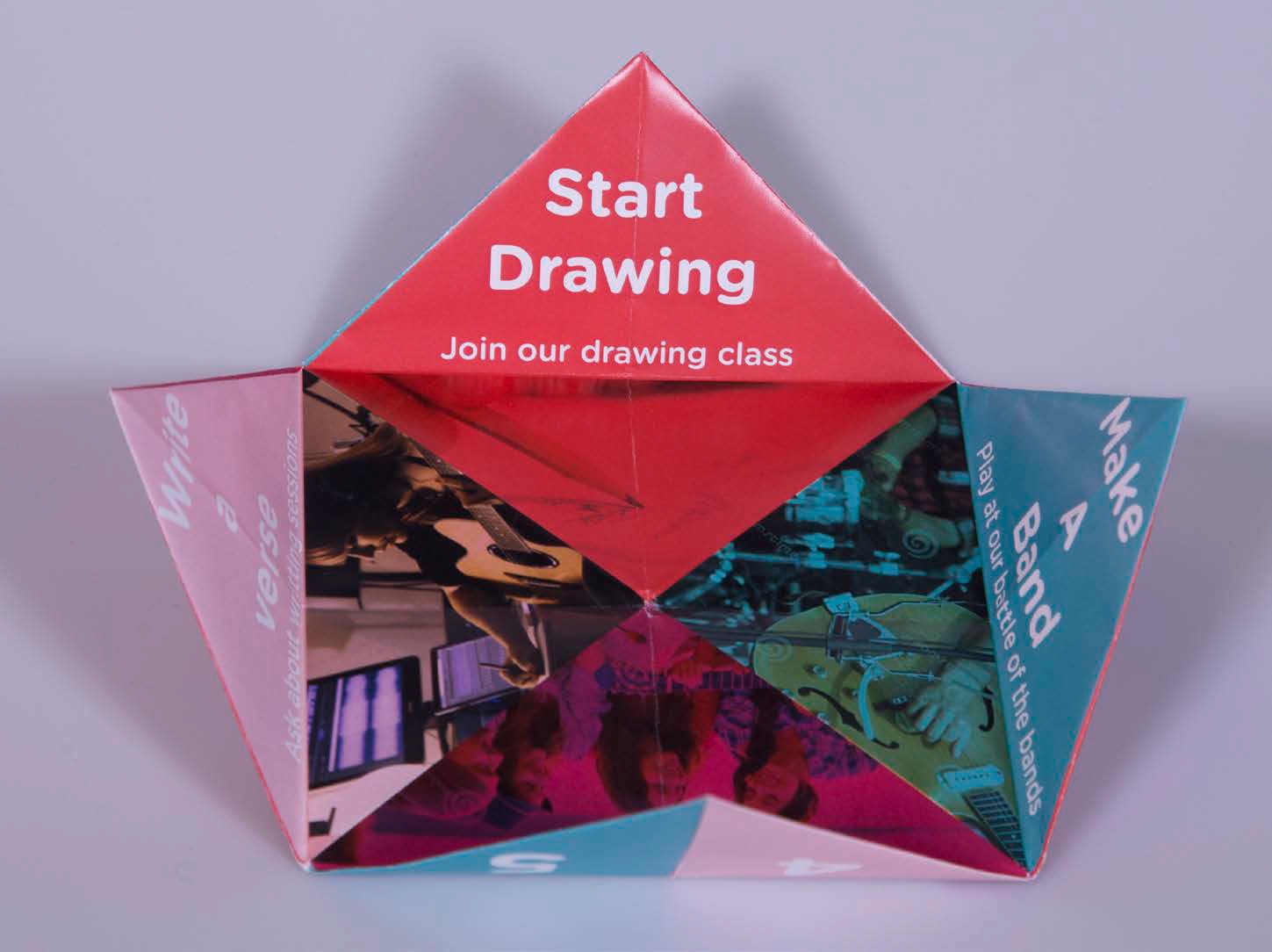
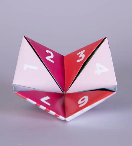
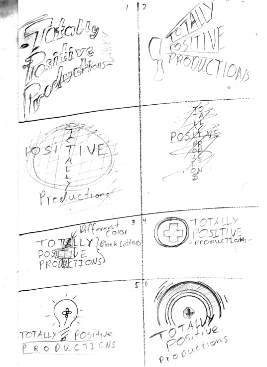
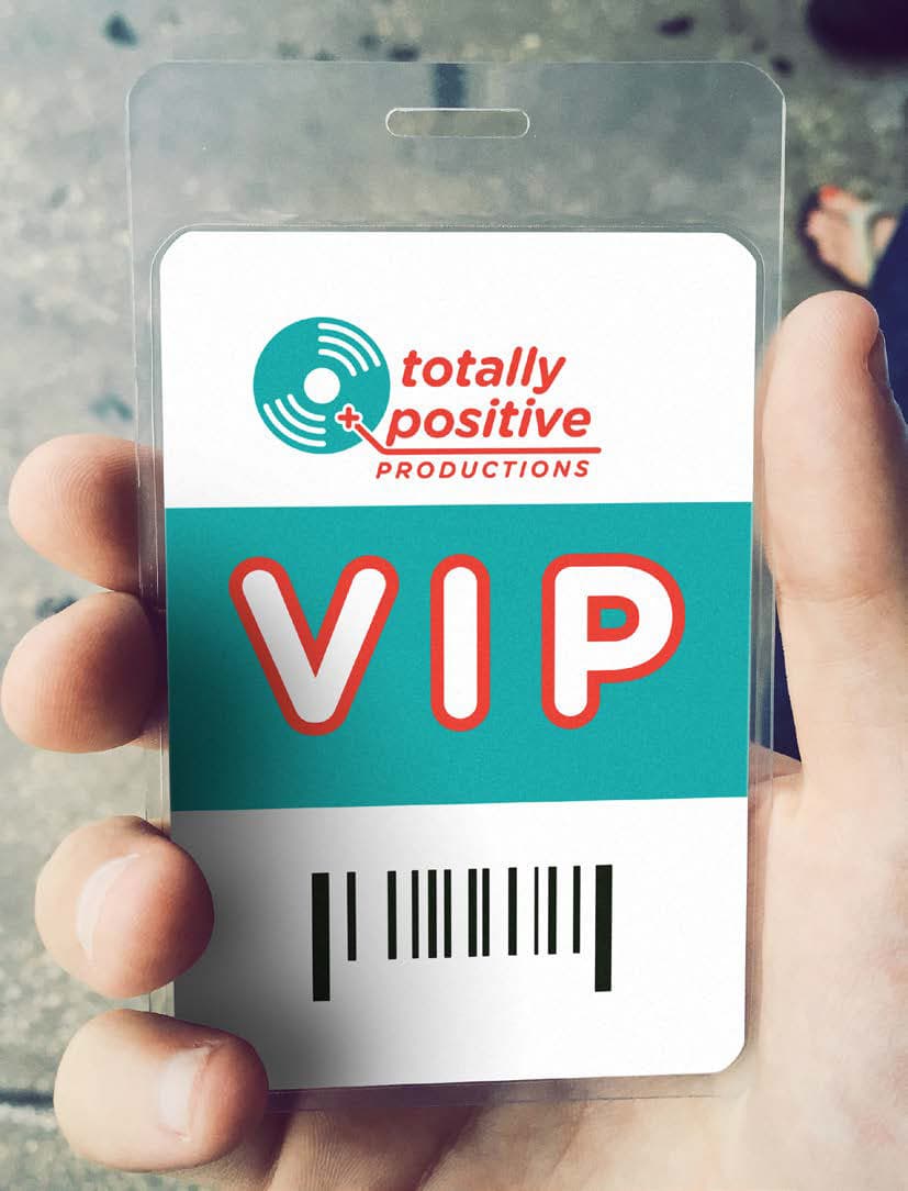
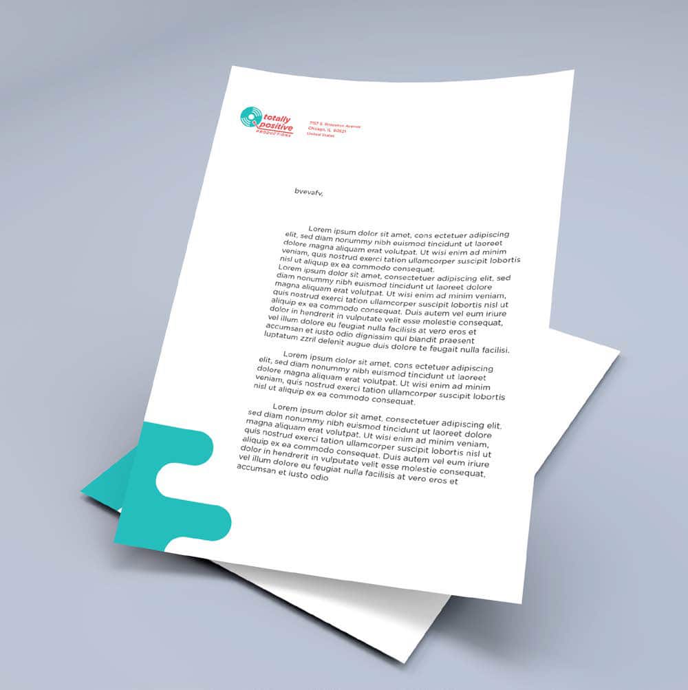
Totally Positive Productions – Company Re-brand
Totally Positive Productions is a non-profit organization dedicated to introducing a variety of artistic mediums to children who don’t have the financial capacity from home to try them. The rebrand was supposed to look help connect to a younger audience and reflect the upbeat attitude of the company.
UI
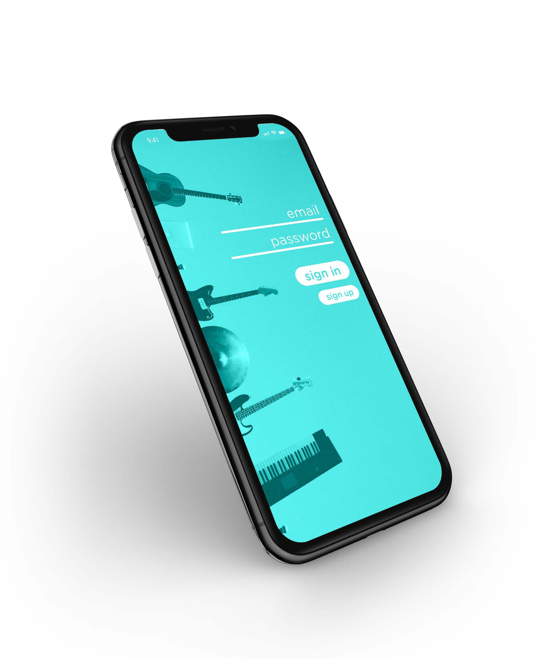
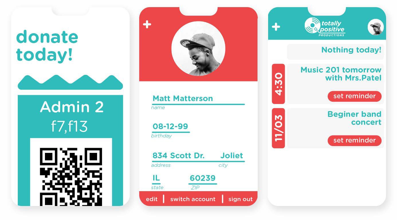
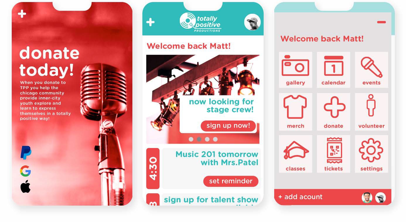
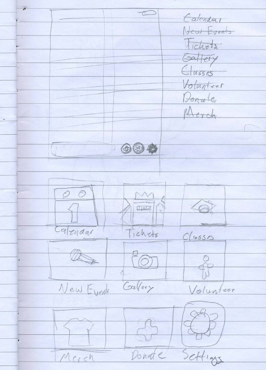
Totally Positive Productions – Community App
The purpose of this app was to help the organization get donations more efficiently, sell tickets, and remind members of current events. The app follows the brand standard I laid out before, using the bright colors and rounded font family to come off as family friendly and fun.
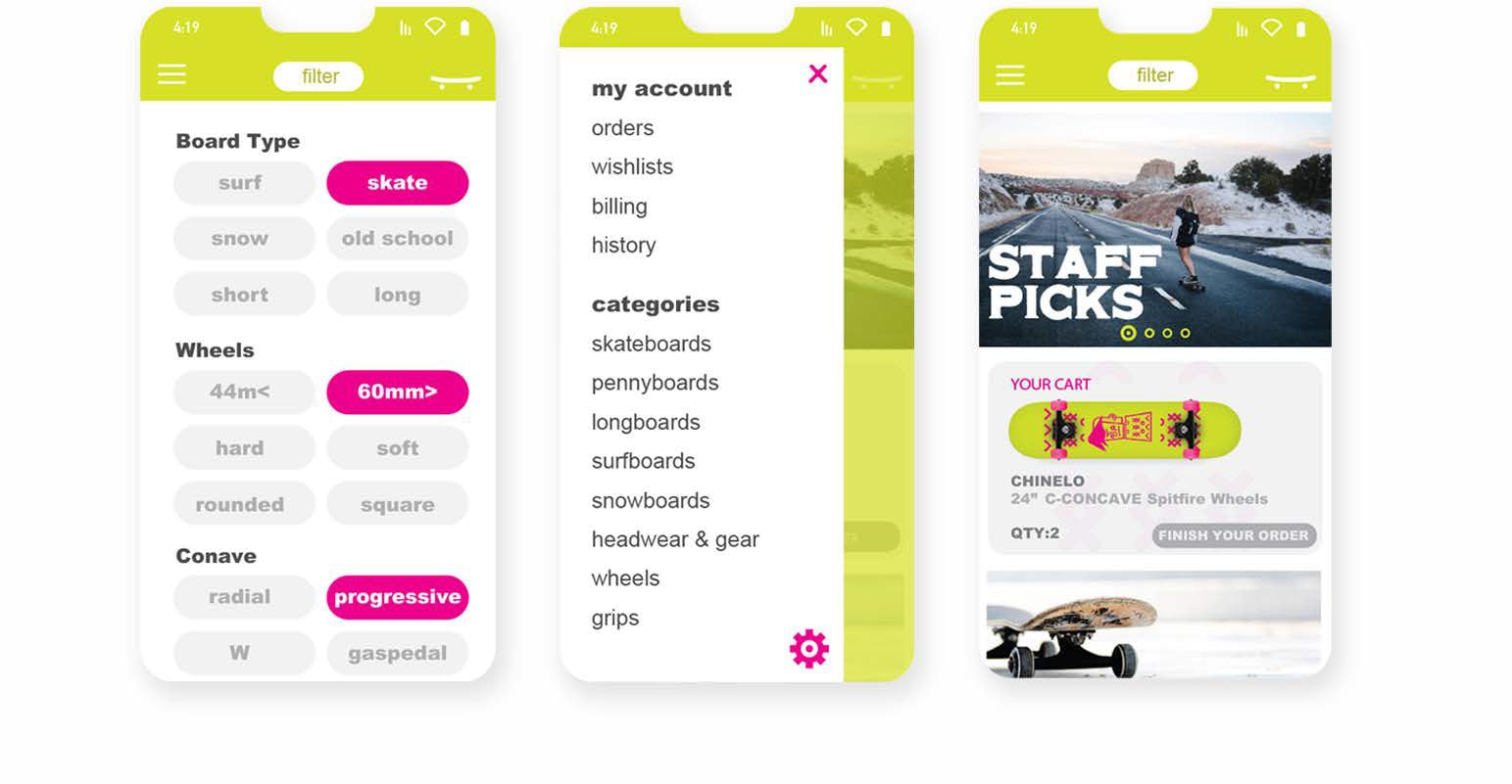
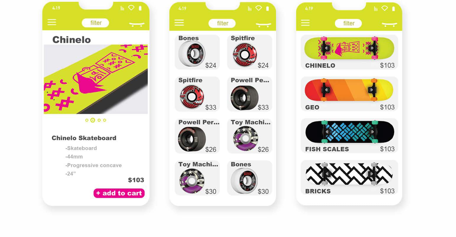
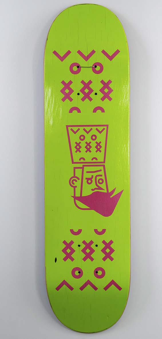
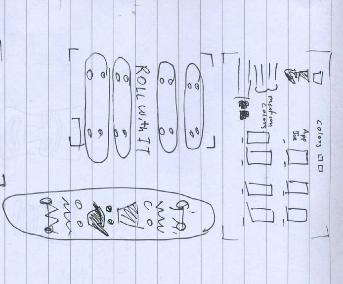
Chinelos Skateboards – Retail App
Chinelos are a traditional costume from Morelos Mexico. And much like skateboards, a colorful expression of oneself and a rebellious symbol of being free. This app is reflective of the freedom of both Chinelos and skateboards by letting the user fully customize their skateboard from the print to the shape of the board.
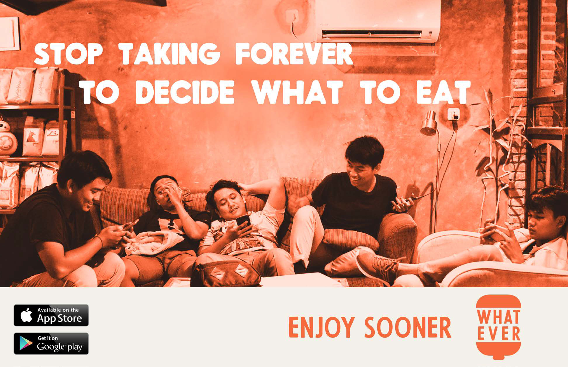
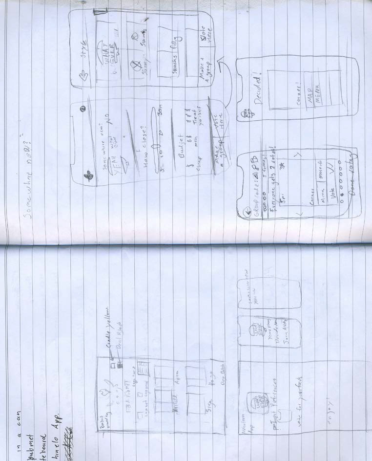
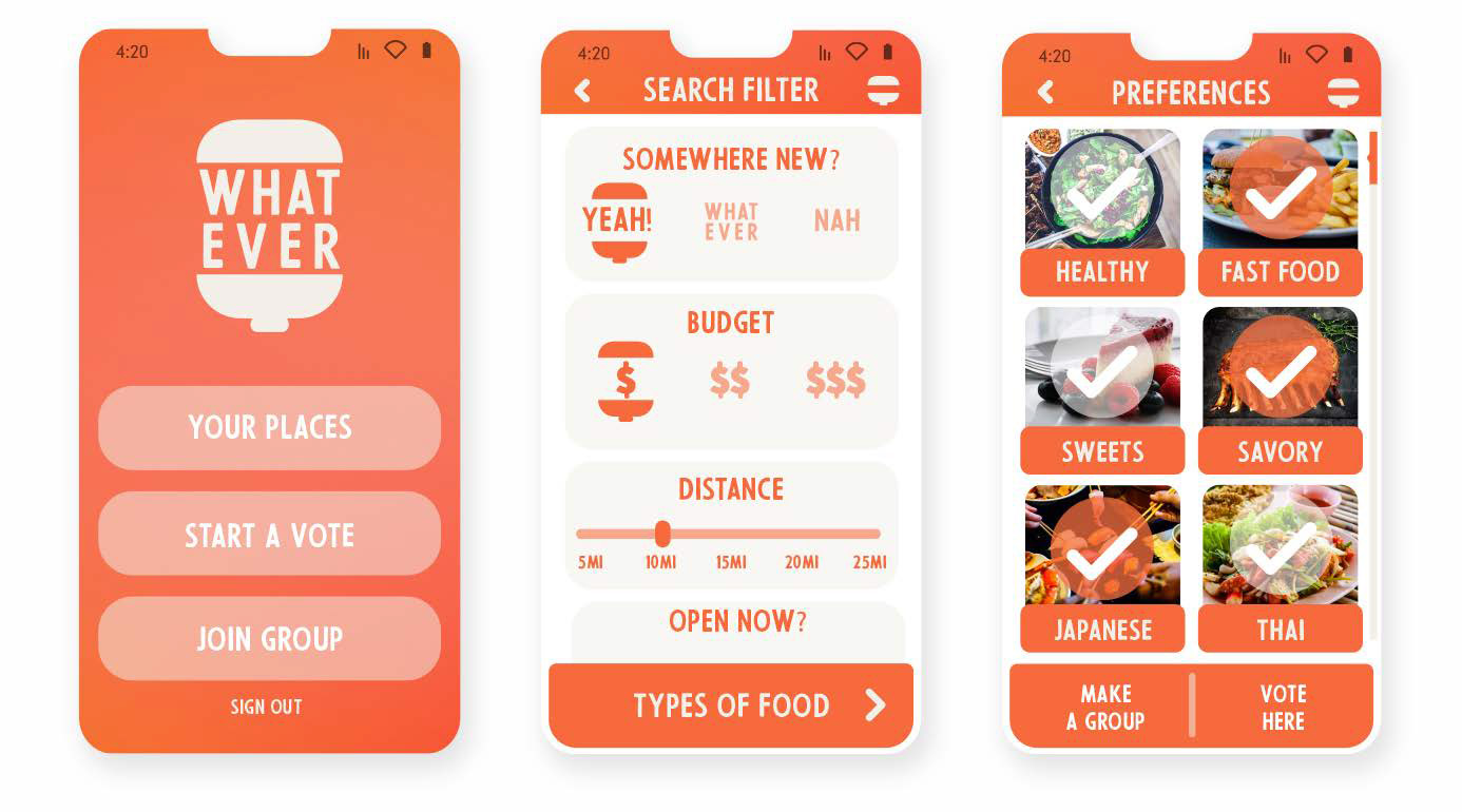
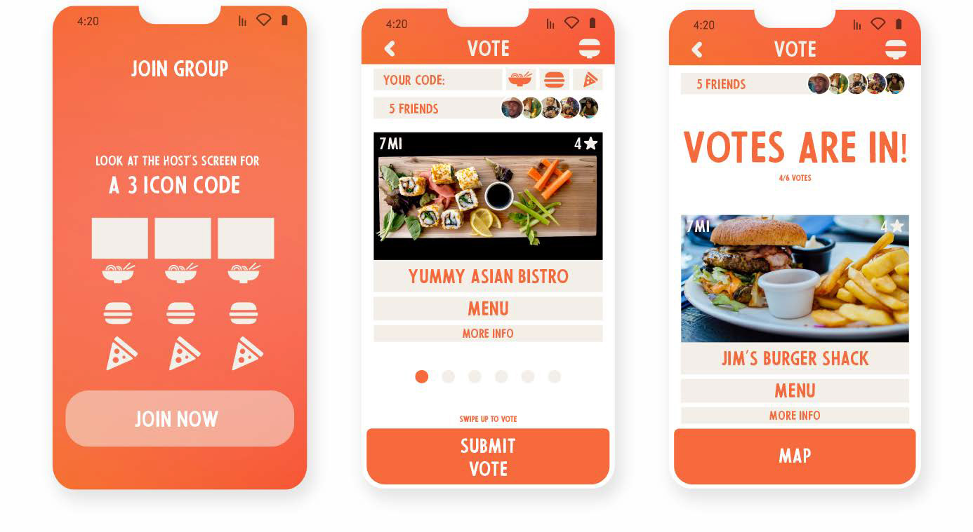
Whatever – Meal Deciding App
Everyone has trouble deciding what to eat. Whatever is an app designed to help groups of people decide on what to eat based on their cravings, likes, budget, distance, and more.
After generating choices it lets people vote on what they like and then the app decides what to eat for you and your group.
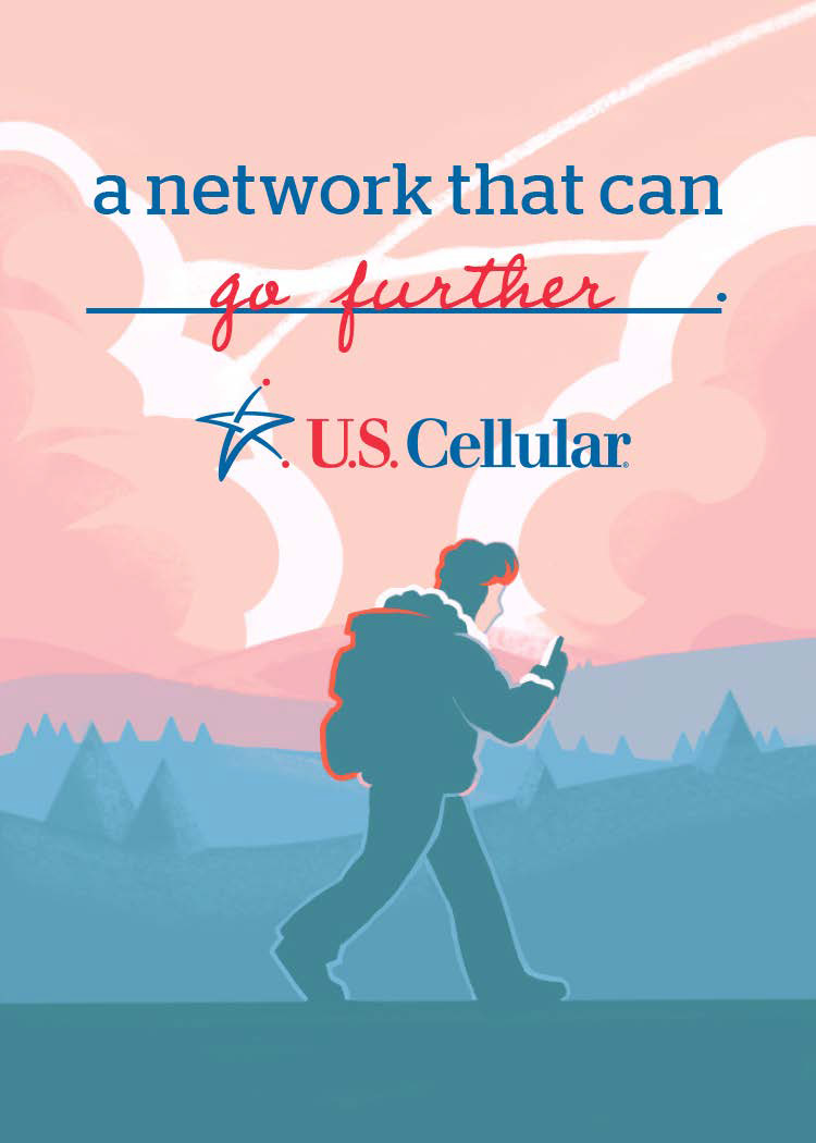
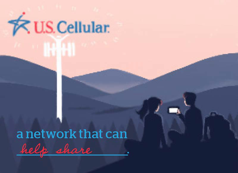
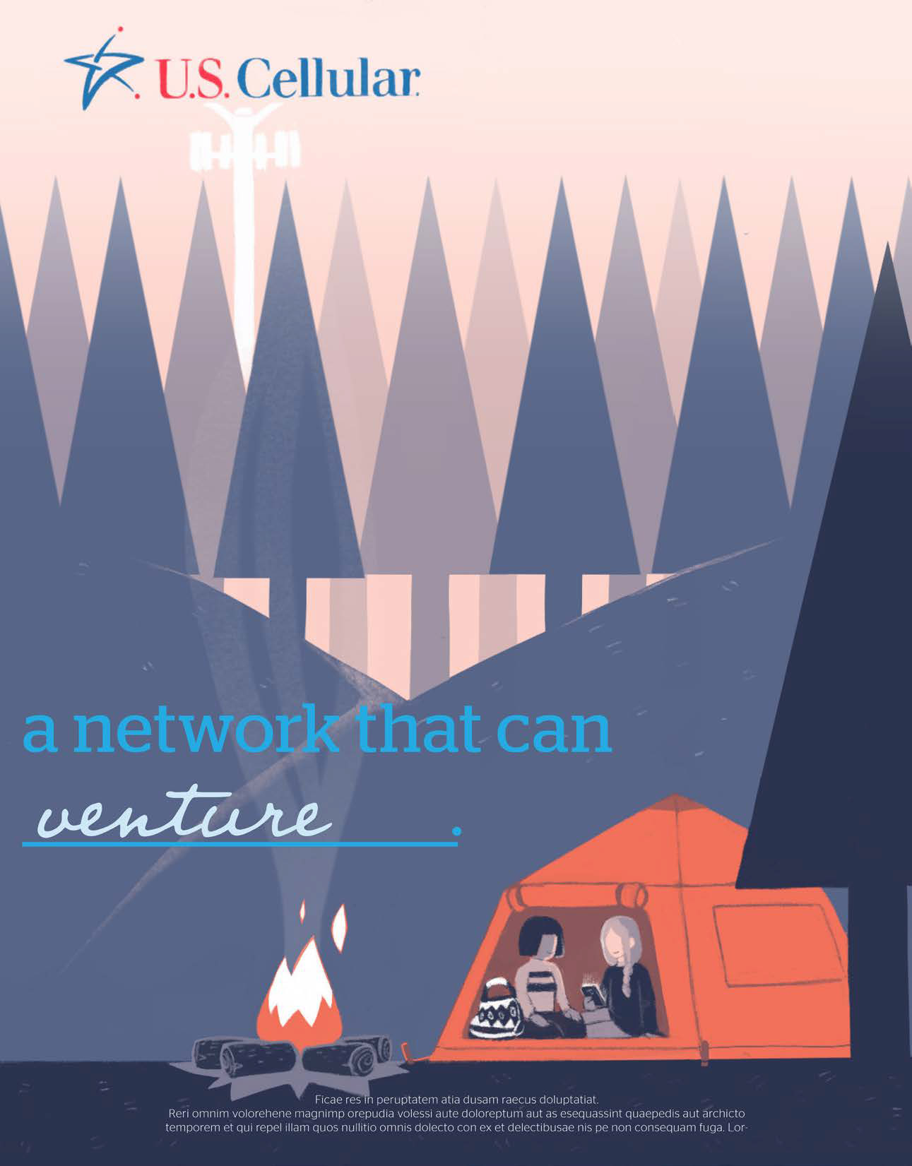
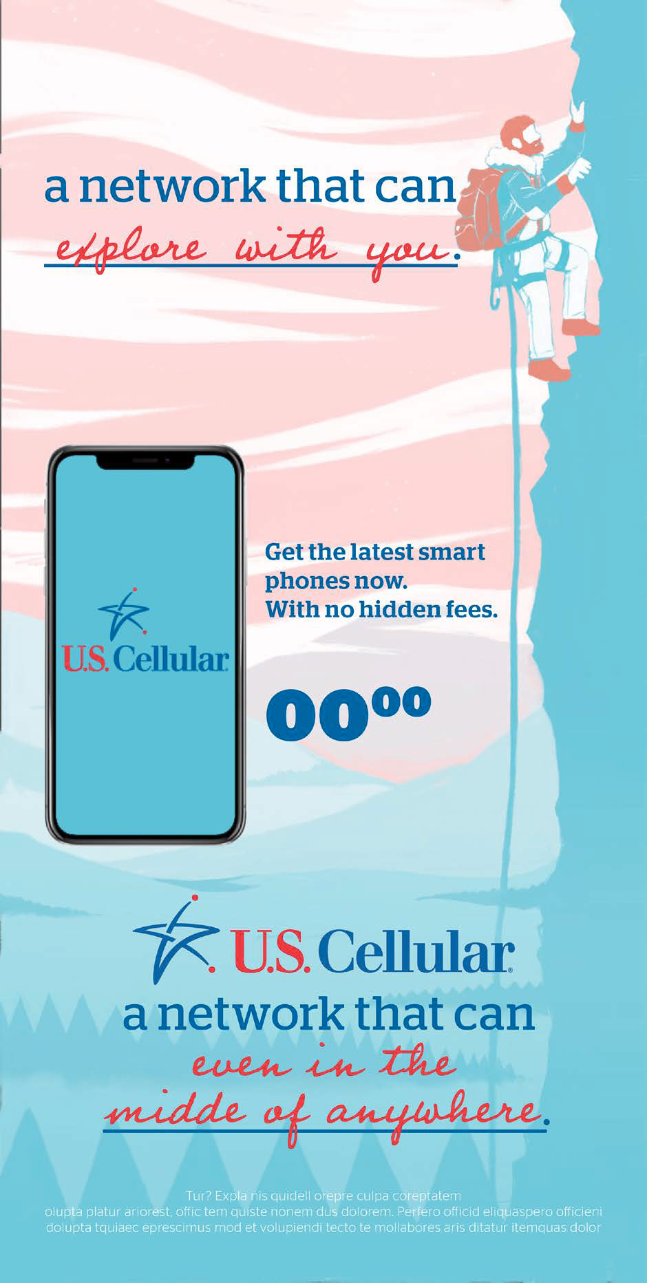
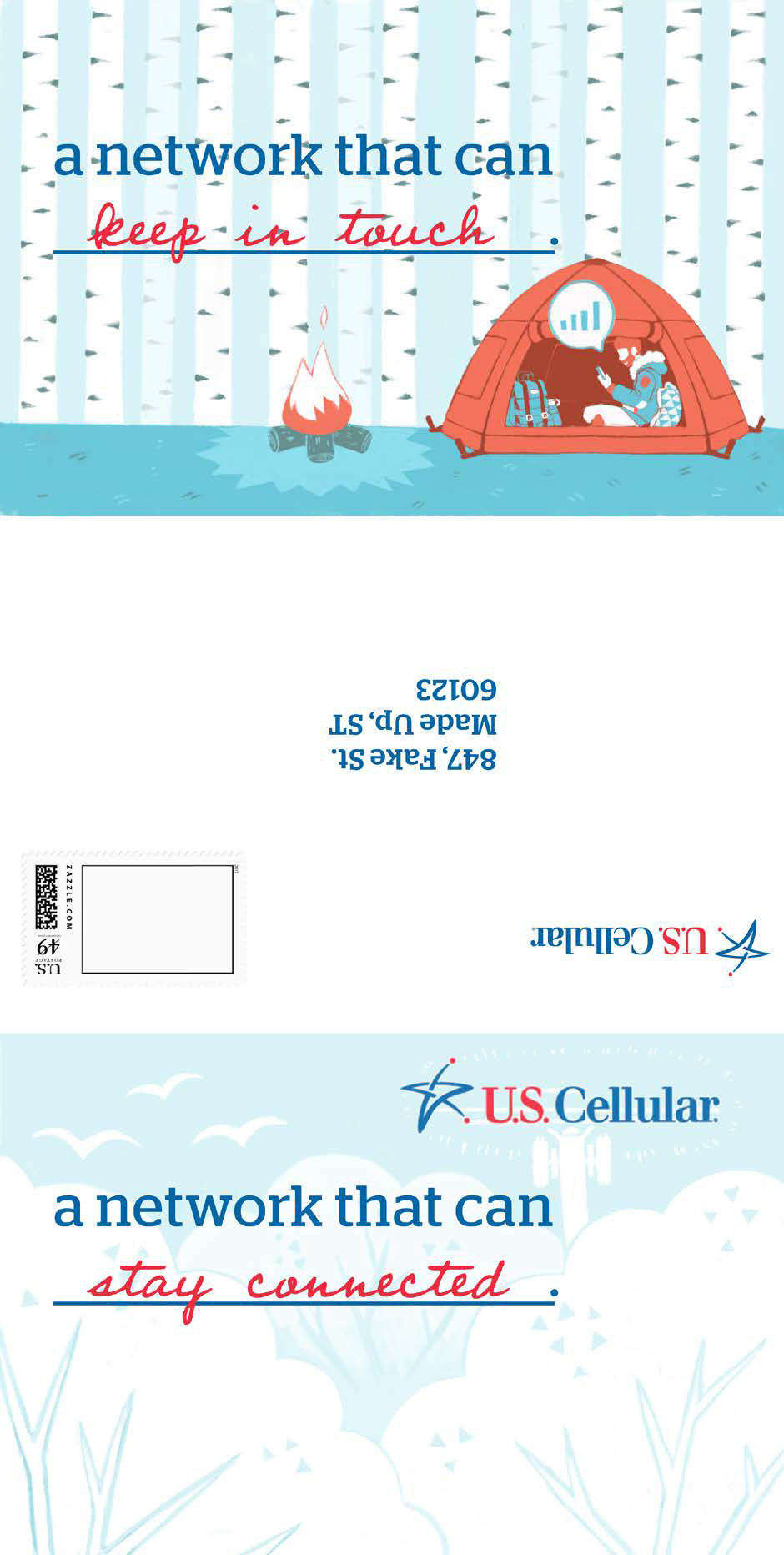
US Cellular – Advertising Campaign Competition
This campaign strategy was made to appeal to a growing millennial demographic. My role involved was set of all design aspects such as layouts, assisting brainstorming, and set up in proper dimensions. A soft and friendly atmosphere was used not only resonate with a youthful audience but to deviate from their competitors. Our team won 1st place.
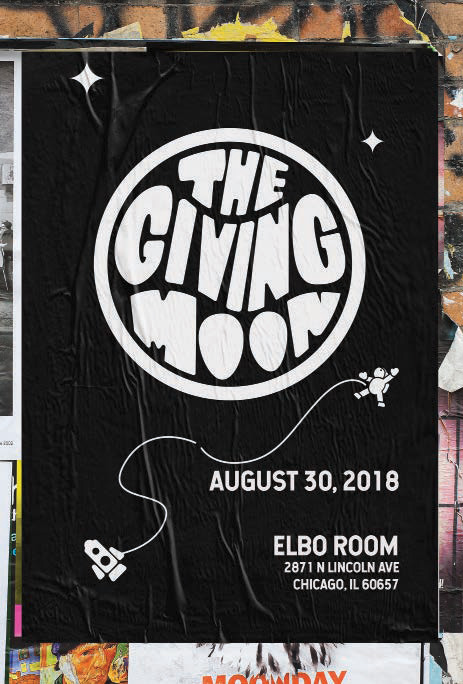
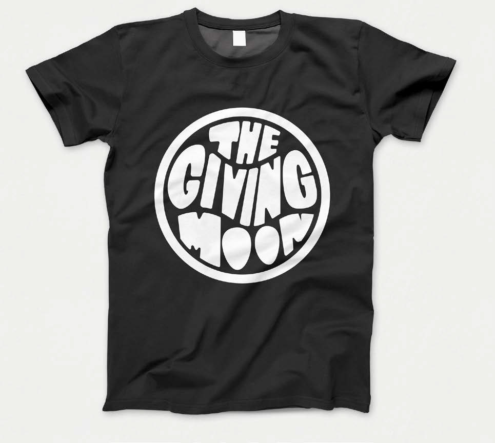
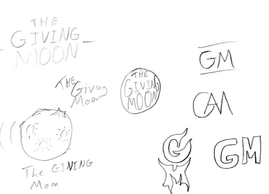
The Giving Moon – Band Merchandise
An alternative rock group in Rockford, The Giving Moon was in need of a recognizable logo that fit the type of music they liked and played. Pulling from Jimi Hendrix album art, the typography was made to not only seem flowing and almost liquid but to also fill the space of a circle resembling a moon when using a white fill.
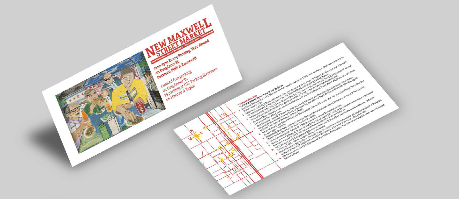
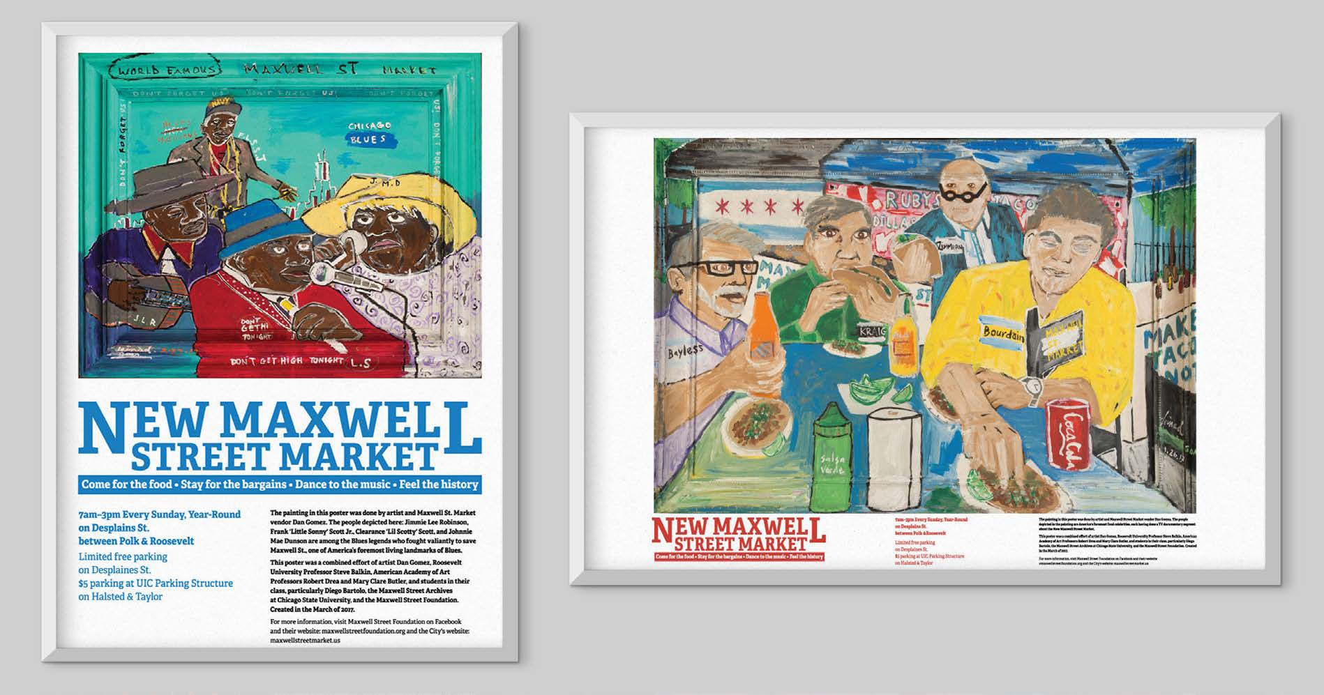
New Maxwell Street – Poster Layout and Flyer Design
A revival of the famous Maxwell Street in Chicago, a New Maxwell Street is growing right now. A collaborative effort with University Professor Steve Balkin, Photographer Robert Drea, Artist Mary Clare Buttler, and artist Dan Gomez went into making these posters. The campaign also included some flyers to distribute to the public and help guide them through historic places and a brief description of each location.
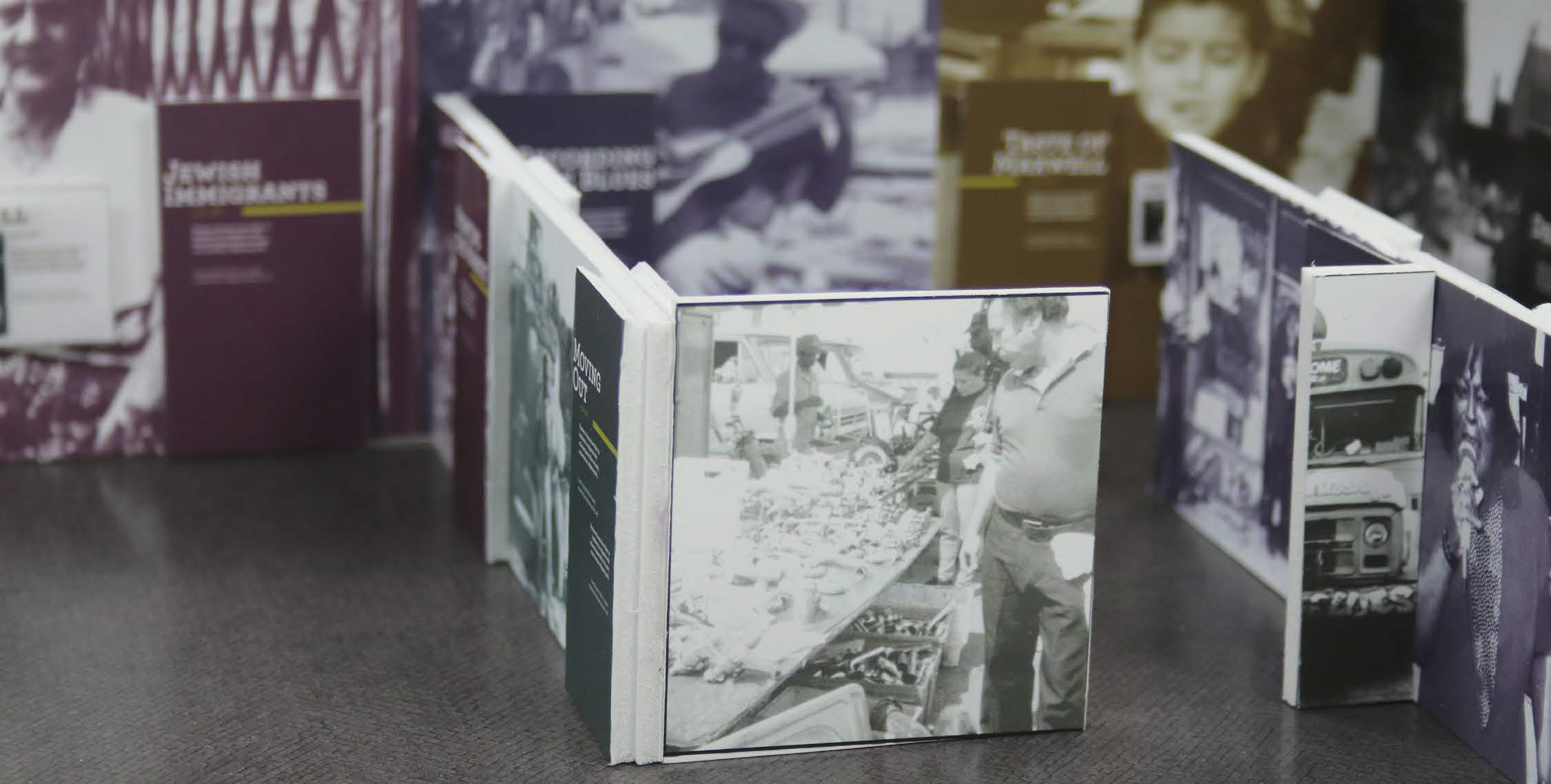
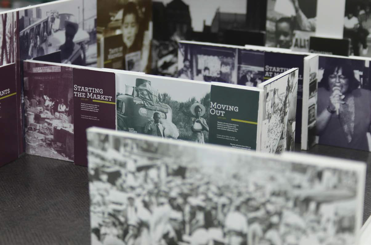
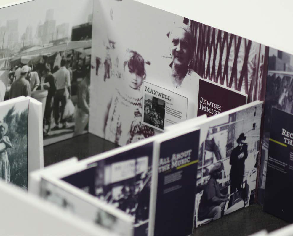
Maxwell Street Exhibition – Museum Environmental Design
Designed with the Chicago History museum layout in mind, this exhibition plan featured a focus on the historical development and influence of Maxwell Street in the diverse city of Chicago. Each topic is color-coded and paired with photography of the era it talks about.
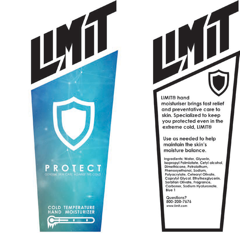
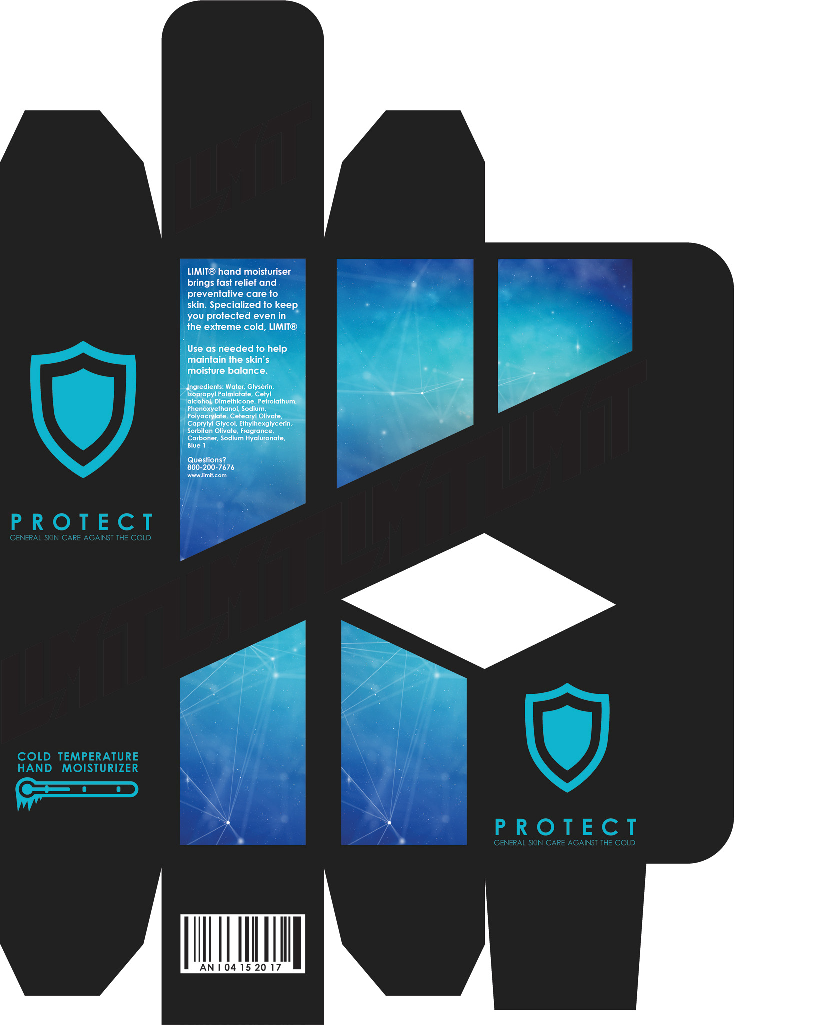
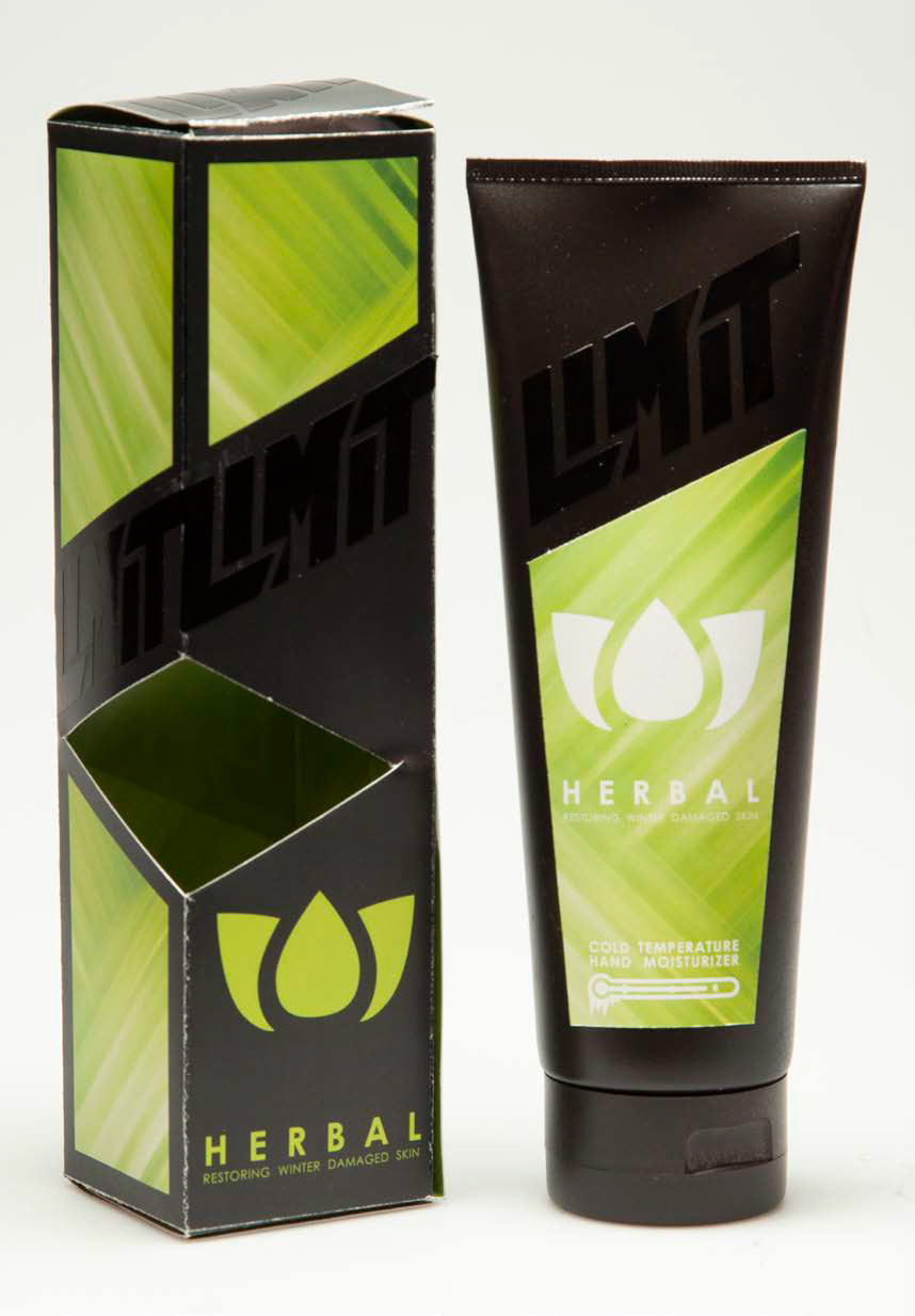
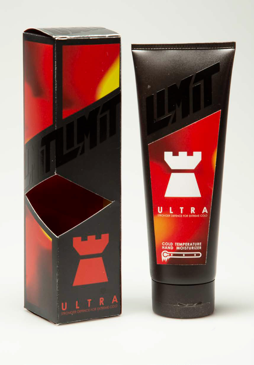
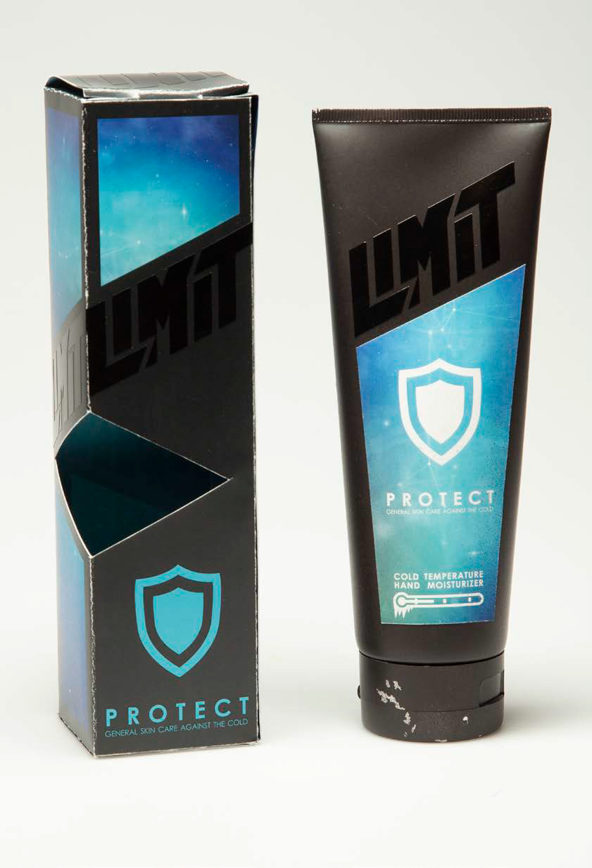
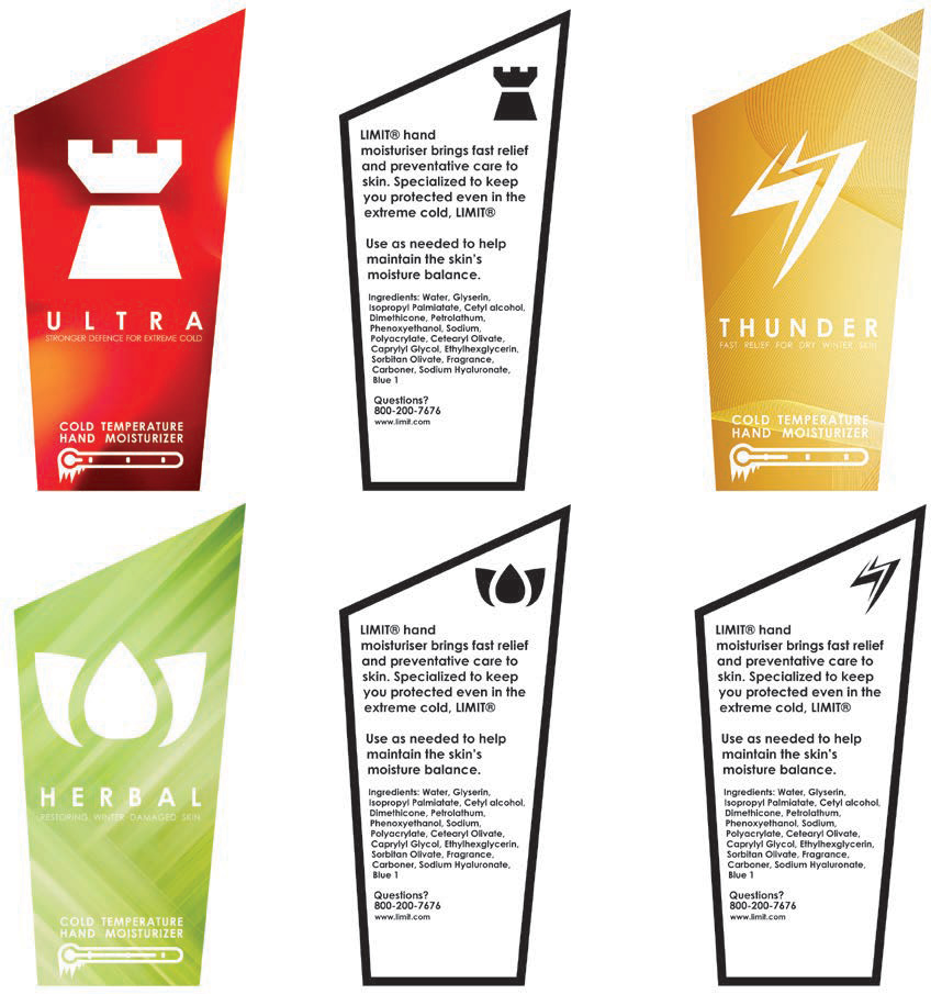
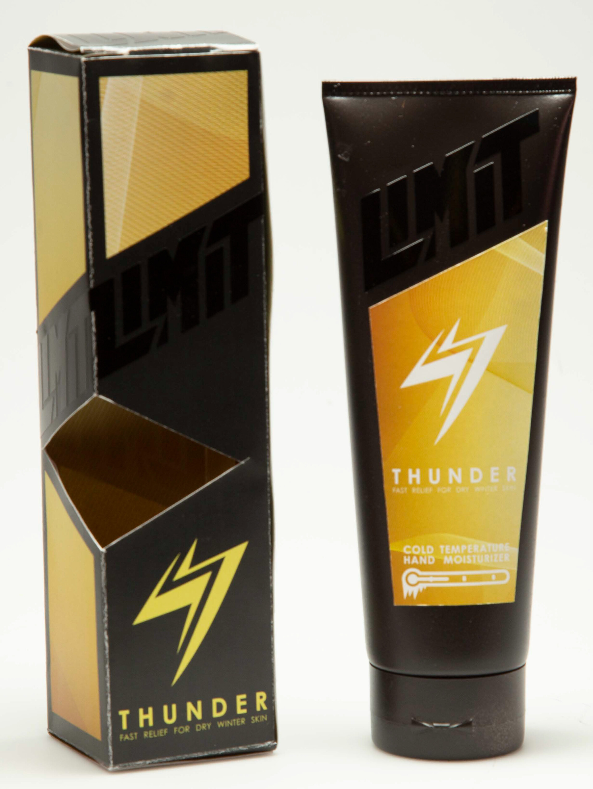
Limit – Cold Weather Hand Moisturizer
Limit was a product designed to appeal to a male audience. It uses sharp shapes and bold colors with a mostly neutral colored background in the packaging and has a gloss black logo to be offset from the paper’s dark color and texture. I used “strong” words such as “ULTRA DEFENSE” and “THUNDER” to make a male consumer base buy something that isn’t usually thought as masculine.
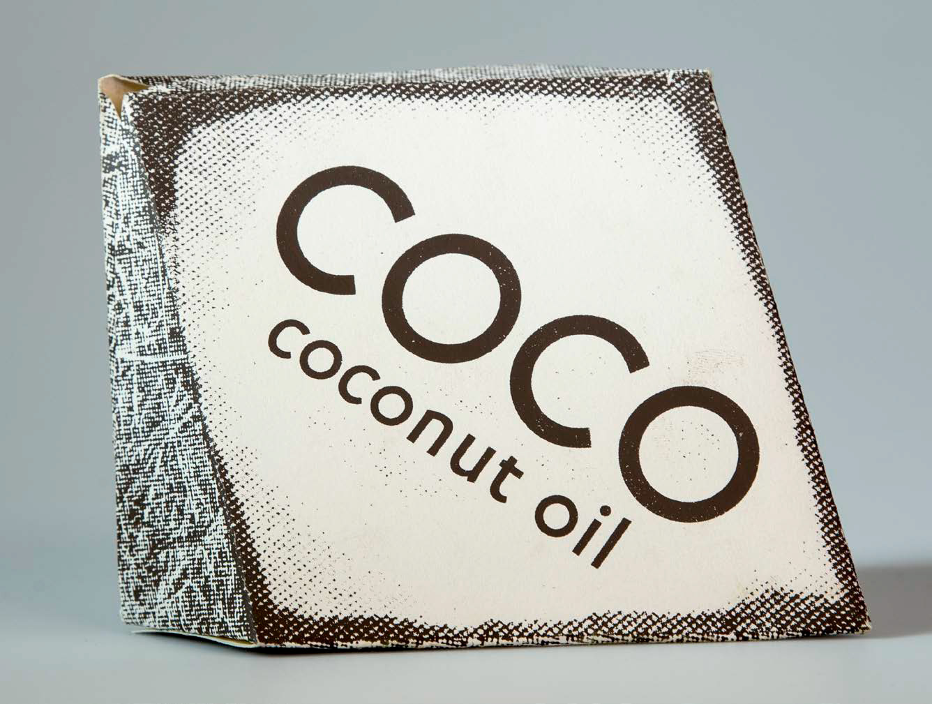
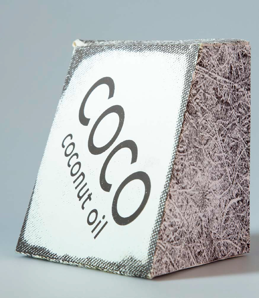
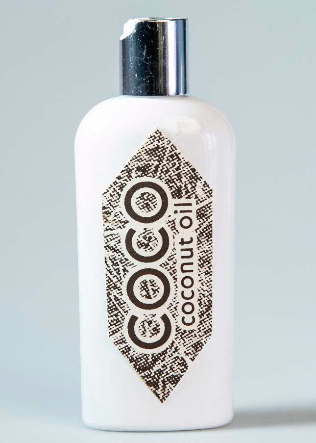
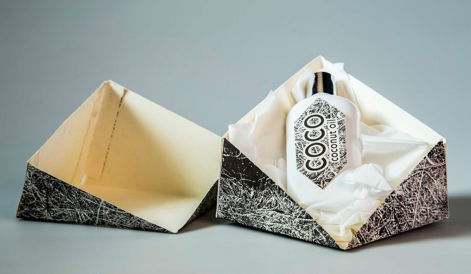
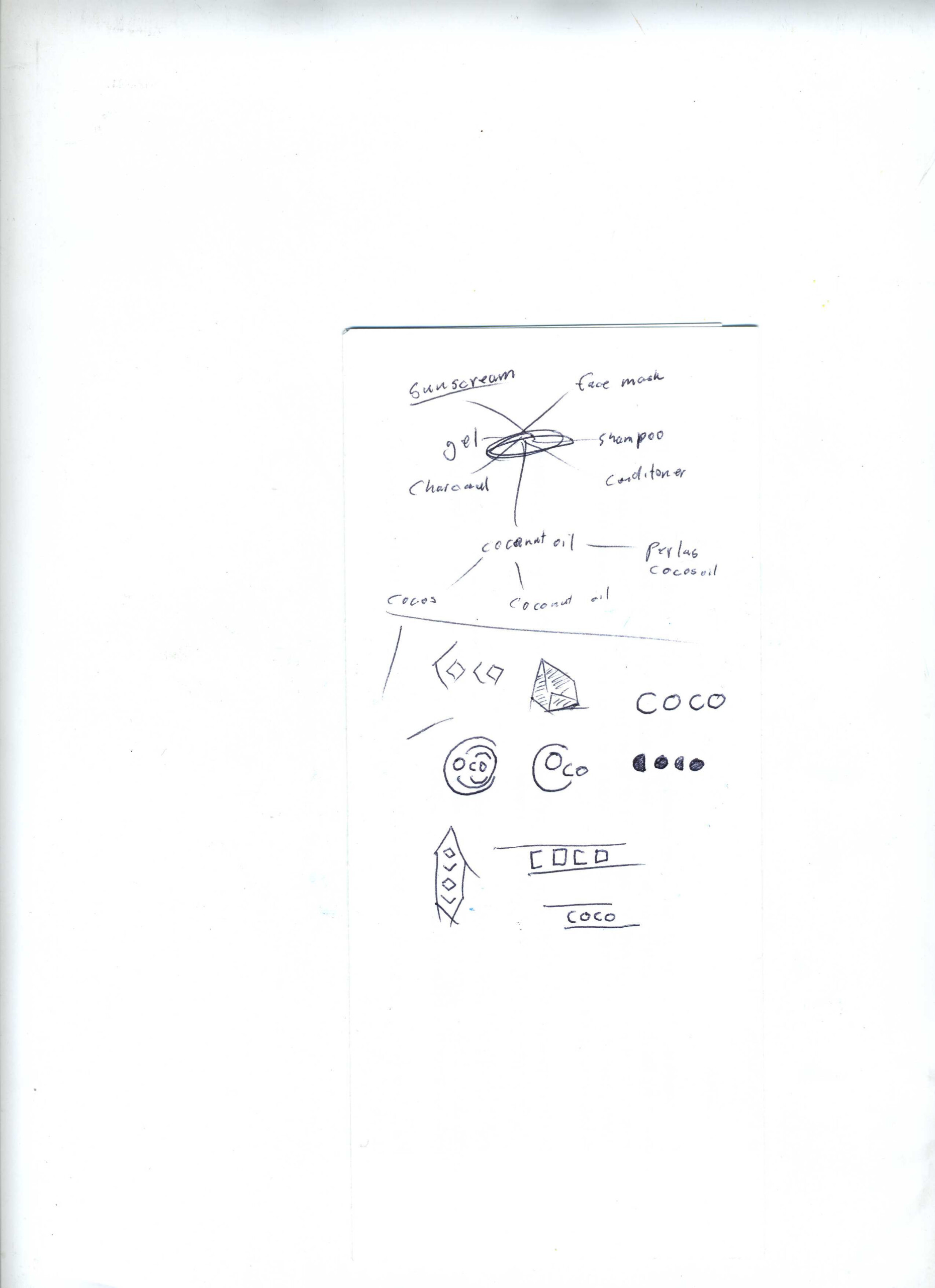
COCO – Coconut Oil
Screen printed on handmade paper, this packaging project was meant to appeal to those looking for quality, organic products. The very box of this product was supposed to reenact a form of cracking open a coconut when removing from the shelves.